Follow this SiteGround Website Builder tutorial to choose a template, edit pages, set styles, add SEO details, and publish your site fast.
SiteGround is best known for WordPress hosting, but in Julian’s walkthrough he tested SiteGround’s own website builder from setup to publish. The process shown was straightforward: start with a demo site, choose a template, customize the homepage, edit key pages, and publish when ready.
If you want a guided way to follow the same workflow, you can try the SiteGround Website Builder for free here.
What Julian tested in this walkthrough
The video focused on the built-in SiteGround Website Builder rather than WordPress. He went through the actual editing flow inside the builder, including template selection, content editing, styling, page settings, navigation, contact details, and publishing.
That matters because this is not a theoretical overview. The steps below reflect what was visibly tested in the builder interface, including what looked easy, what needed manual cleanup, and where the platform felt more limited.
1) Start with the demo site and choose a template
Julian began by clicking Start for free, signing up, and landing on a page that said the account was ready with a demo site to launch. From there, SiteGround prompted him to choose a template.
His main takeaway was that the template library was not huge, but that can also make the choice easier for beginners. He previewed a design, checked both desktop and mobile views, and then applied it.
What to do here
- Sign up and open your demo site.
- Browse the available templates.
- Use Preview before committing.
- Check the mobile preview, not just desktop.
- Click Apply when you find a layout you like.
He also showed that you can change the template later, so the first choice is not permanent.
2) Check the dashboard settings before editing
Before customizing pages, Julian opened the admin area. He pointed out that this is where SiteGround surfaces settings and site-management tools such as marketing options, Google Tag Manager integration, on-page SEO, and analytics.
He also changed two basic settings first: time zone and site language. In his example, he set the time zone to Berlin and kept the site language in English.
That is a small step, but it is worth doing early so your site settings match your business and audience.
3) Customize the homepage content
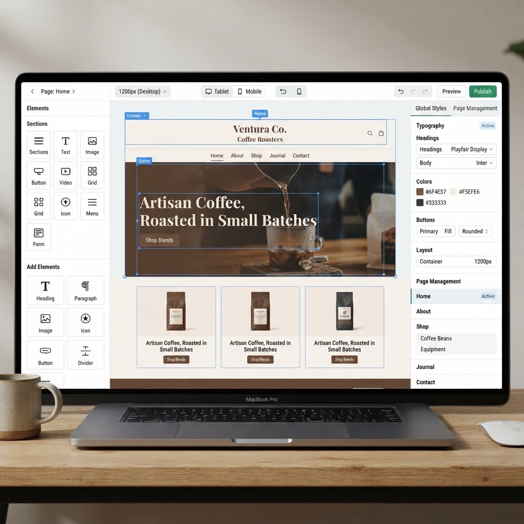
Inside the builder, Julian moved into the homepage and started editing sections directly. The interface showed live pages on one side, plus global sections such as the header and footer.
The first edits were very practical: swap images, rewrite the text, change text styles, and test links.
Replace images
He clicked Update on an image, opened the gallery, and uploaded his own file. That change was immediate.
He also showed a second option: SiteGround connects to the Unsplash library, so you can search for stock photos inside the builder. In the demo, he searched for a healthcare-related image and replaced a less relevant default image with one that fit the site better.
Edit text and headings
Julian clicked into the default text and rewrote it with a healthcare example. He also changed a paragraph into a Heading 1, adjusted font size, and added a smaller subheading underneath.
The useful point here is that text editing is inline. You can change:
- Paragraph text
- Heading level
- Font size
- Text style
- Links inside text
He mentioned using ChatGPT for draft copy if writing is a weak point, but the builder itself simply handles the formatting and placement.
Add links to text and buttons
The builder lets you attach links to:
- Another page on your site
- A custom URL
- An email address
- A phone number
- A file
Julian demonstrated both a text link and a button link. For the button, he changed the label to Contact us and linked it to the contact page. He then used preview mode to confirm the button sent visitors to the right page.
That is worth copying on your own site: after every important link edit, preview it once.
4) Set global styles before tweaking individual sections
One of the best practical tips in the video was to avoid changing colors section by section too early. Instead, Julian opened the Style area and adjusted the overall look of the site first.
From there, he tested:
- Color palettes for the full site
- Font combinations
- Button shapes such as rounder or sharper styles
His advice was clear: pick a main theme and stay consistent. That is faster than editing every text block and background individually, and it usually produces a more professional result.
| Area | What Julian changed | Why it matters |
|---|---|---|
| Colors | Switched site-wide palette | Keeps branding consistent |
| Fonts | Tested alternate font styles | Changes the overall tone quickly |
| Shapes | Adjusted button styling | Helps match the site’s visual style |
| Sections | Moved, deleted, and restructured layouts | Makes templates fit your content better |
5) Edit sections, columns, and layout blocks
After setting the global design, Julian worked through individual sections on the homepage. He showed that you can move a section up or down, or remove it entirely if it does not fit your site.
He also edited the section structure itself. In the example, he changed column layouts and showed options ranging from one column up to five columns.
This is one of the easiest ways to turn a generic template into something more specific to your business. You do not have to accept the default section structure as-is.
Useful details he confirmed
- Changes are saved automatically.
- You can use undo if you do not like a change.
- The site is already optimized for mobile view, and you can toggle between desktop and mobile previews.

6) Set up the header, logo, favicon, and footer
Julian then moved to the global header. He tested different header layouts, menu positions, and color treatments, and preferred a layout with the logo on the left and the menu on the right.
Logo upload
He first typed a text-based site name, but said it did not look as good as using a proper uploaded logo. After uploading a logo, he adjusted the size.
One useful observation from the test: a horizontal logo worked better in the header than a more vertical arrangement. That is a practical design tip if your uploaded logo feels cramped.
Favicon
SiteGround had already inserted the uploaded logo as the favicon. Julian noted that favicon designs generally work better without tiny text, since browser tab icons are so small.
Footer
In the footer, he showed how to:
- Add a logo or site name
- Add social icons such as Instagram, YouTube, and LinkedIn
- Paste the correct profile URLs for each icon
- Hide the “powered by SiteGround” credit with a toggle
He also highlighted the policy area. From the policy settings in the admin section, you can add text for items such as a privacy policy and terms of service, and those links can then appear automatically in the footer.
7) Edit the built-in pages: FAQ, Contact, About, and Services
From the Content area, Julian opened the default pages included with the template. These included pages such as About, Contact, FAQ, and Services.
FAQ page
He showed that adding a new FAQ item is simple: create a new item, click into the question, and then type the answer.
Contact page
The contact page had several useful settings:
- Business address
- Phone number
- Email address
- Contact form destination email
- Thank-you message after form submission
- Embedded map area
A particularly helpful tip was to link the phone number as a phone link and the email as an email link. On mobile, clicking the phone number can open the phone app directly, while clicking the email can open the visitor’s email app.
He also showed that the contact form can be set to send messages to your chosen email address, and that the map can be repositioned by entering and adjusting the address.
About and Services pages
These pages can be edited normally with your own text and images. If a page is not relevant, he showed that you can simply delete it, and it will no longer appear in the menu.
8) Add a new page, set SEO details, and publish
Julian also created a new page from a template. During that process, he set:
- The page name
- The URL slug
- An SEO title
- An SEO description
- A social sharing image/description
He specifically called out the importance of the URL slug and page SEO fields for search visibility. After that, he published the page.
One last step remained: adding the page to the navigation. In the Navigation area, he created a new menu item, selected the page, and added it to the main navigation so it would appear in the header menu.
What stood out in the test
Here is the clearest balance of strengths and limitations from the walkthrough.
| Strengths | Limitations |
|---|---|
| Fast setup from a demo site | Template selection looked fairly limited |
| Easy inline editing for text and images | Some default assets were generic and needed replacing |
| Unsplash access inside the builder | Branding still looks better when you bring your own logo |
| Global styles for colors, fonts, and shapes | You still need to manually add new pages to navigation |
| Automatic saving and undo | Advanced customization was not the focus of the demo |
| Mobile preview built in |
How it compares with other ways to build a site
If you want a builder-first experience with quick setup, SiteGround makes sense. If you want a broader look at a more established builder with many templates and a larger ecosystem, see this detailed Wix Review 2026.
If your real goal is maximum flexibility through WordPress rather than a built-in builder, this guide on how to build a WordPress website with AI is a better match. And if you want to compare with another beginner-friendly AI-led workflow, this Gamma AI Website Builder tutorial is also useful.
Who should use SiteGround Website Builder?
Based on the test, this builder is a good fit for:
- Beginners who want to publish quickly
- Small businesses creating a brochure-style site
- Users who prefer editing a template over starting from scratch
- SiteGround customers who want a simpler alternative to WordPress
It is less compelling if your top priority is a huge template marketplace or a highly specialized design workflow.
Final verdict
From this walkthrough, SiteGround Website Builder looks like a solid option for getting a clean business website online fast. The strongest parts were the simple editing flow, built-in mobile preview, global style controls, and practical page tools like contact settings, FAQ editing, and per-page SEO fields.
The main trade-off is template variety. Julian noted there were not many templates, which may feel limiting if you want lots of starting points, but it can also make setup less overwhelming for beginners.
If you want a straightforward builder inside the SiteGround ecosystem, this is an easy tool to recommend. You can try the SiteGround Website Builder for free here and follow the same setup process shown in the video.
● FAQ